BUSHBLOK® Logo
Logo Description
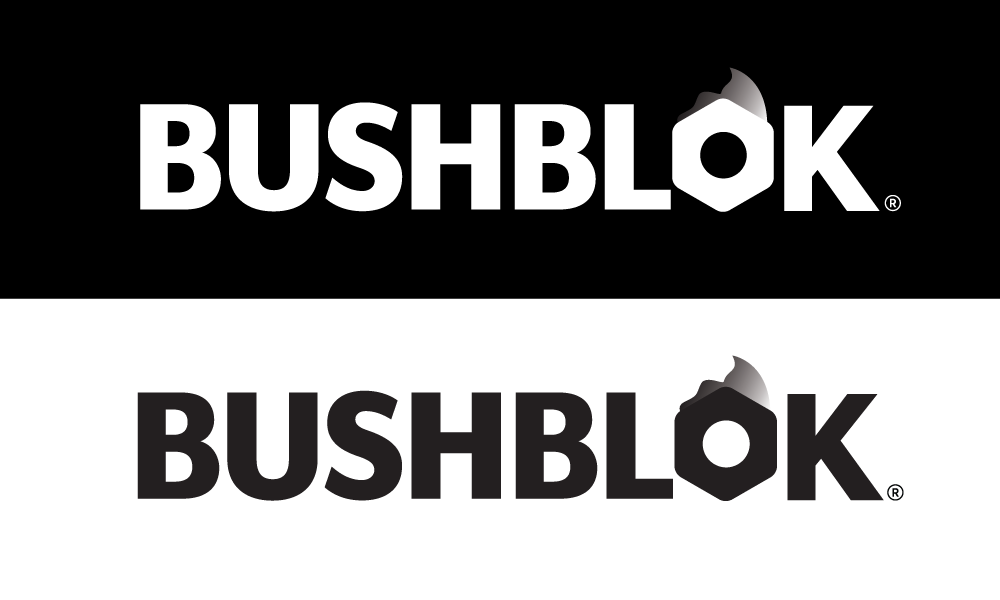
The BUSHBLOK® logo consists of the word “BUSHBLOK” in bold, uppercase, sans-serif typography. The ‘O’ in “BLOK” is stylized as a hexagonal woodcut shape, integrating a small flame at the top right, symbolizing the transformation of invasive thorn bush into sustainable fuel briquettes.

The color palette primarily includes:
- Dark Charcoal Grey (#231f20) – Represents burned wood/charcoal, linking to the fuel log’s use as a clean-burning fuel source.
- Natural Brown (#8f673c) – Symbolizes wood biomass from encroaching bush
- Orange – Yellow Gradient Flame (#ef3e23 – #fed600) to represent the energy and combustion properties of the BUSHBLOK® fuel logs.
Font
Mr Eaves XL San Nar OT, Heavy. This is a font available in the Adobe Font library.
Logo Usage Guidelines
Color Variations
Primary Version: The full-color logo (dark charcoal grey text, brown woodcut, orange/red flame) should be used whenever possible.
Black & White Version: When color is not an option, use a monochrome version to maintain legibility.
Reversed Version: When placing the logo on a dark background, use a white or light-colored version for contrast.
Clear Space & Sizing
- Maintain a clear space around the logo equivalent to the height of the ‘B’ in “BUSHBLOK®” to avoid clutter.
- Minimum size for print: 1.5 inches (3.8 cm) wide for legibility.
- Minimum size for digital: 150 pixels wide to ensure clarity.
Background Considerations
- Place the logo on neutral or contrasting backgrounds to ensure visibility.
- Avoid placing it on busy or overly textured backgrounds.
- Do not use the logo on colors that clash with its primary hues.
Improper Logo Usage (Do Not)
- Do not alter the colors of the logo.
- Do not distort or stretch the proportions.
- Do not add effects (such as shadows, gradients, or outlines).
- Do not rotate or tilt the logo.
- Do not replace the stylized ‘O’ with any other shape.
- Do not use the logo within a sentence—it should always be standalone.
Placement & Alignment
Preferably aligned left or center in layouts. Always ensure high-resolution usage for print and web.
Flaming ‘O’ Icon
The BUSHBLOK® flame icon (the stylized ‘O’ with a gradient flame) can be used as a standalone brand mark for compact applications, such as product stamps, social media icons, or certification seals. It must always retain its original colors and gradient. The icon should never be used in black-and-white, monochrome, or reversed color variations, as this diminishes its recognition and intended visual impact.
BUSHBLOK® Logo Variants
BUSHBLOK® Offcuts is a value brand of wood briquettes made from the trimmings and broken pieces of premium fuel log production. The brand provides an affordable heating solution while still offering sustainable and reliable performance.
The BUSHBLOK® Offcuts logo follows a similar design structure as the Bushblok Premium Wood Briquettes logo but with a slight variation of added text “OFFCUTS” with black, white and grey packaging to differentiate the two brands. The word OFFCUTS uses font Allumi Std Extended Inline, Black 24 A – This is a font available in the Adobe Font library.
